Beyond Heatmaps: Mapping Two Variables with Plotly in Public Health
Background
In public health and epidemiology, data visualization isn’t just about aesthetics—it’s about clarity, impact, and storytelling. Choropleth maps, which color-code geographic areas based on variable intensity, are a go-to tool for illustrating spatial trends in disease burden, health behaviors, or population risk factors.
But what if you want to compare two variables simultaneously on the same geographic map?
This is a common challenge in health data storytelling. For instance, imagine you’re studying the distribution of a dietary habit and the associated disease outcomes—how do you present this relationship clearly and intuitively?
💡 Innovation Highlight Overlay a bubble map on top of a choropleth map. The base layer (choropleth) provides a regional context for one variable, while the overlaid bubbles show the intensity of another, allowing for quick visual comparisons.
This post shows how to combine two variables on a single map using a dual-layer approach — choropleth for spatial intensity + bubble size for a second variable. It’s a simple but powerful storytelling technique.
📌 Real-World Example
In 2020, a preprint suggested that fermented vegetable consumption might be inversely associated with COVID-19 mortality in Europe—even after adjusting for confounding factors. I wanted to explore that hypothesis using public data and an interactive map.
This interactive map overlays fermented food intake (bubbles) on COVID-19 death rates (color). Scroll down to learn how it’s built.
📦 Quick Start
- Install dependencies
- Download the dataset (link)
- Run the notebook

- Explore the interactive map
What You’ll Need to Recreate This Map
To recreate the interactive map and plots in this post, you’ll need a few Python packages commonly used in data science:
# Core data handling
import pandas as pd
import numpy as np
import matplotlib.pyplot as plt
import seaborn as sns

# Interactive map visualization
import plotly.express as px # Creating choropleth and scatter_geo maps
import plotly.graph_objects as go # Overlaying plot layers and annotation

# For geospatial data
import requests # Fetching GeoJSON data from remote URL
import json # Parsing JSON data
import pycountry # Mapping country names to ISO alpha-3 codes

# For exporting maps
import plotly.io as pio # Exporting Plotly figures as HTML
import kaleido  # Saving Plotly maps as static images (optional)
💡 Tip: This tutorial uses Python packages like pandas, plotly, and pycountry. You can install all dependencies by running:
pip install -r requirements.txt
Or check out the full notebook on GitHub to explore the code and interactive map.
Why plotly.express?
For this project, I used plotly.express to create interactive choropleth and bubble maps. Unlike traditional plotting libraries like matplotlib, plotly.express lets you explore maps by hovering, zooming, and clicking — all right inside your browser or Jupyter Notebook.
It’s a powerful yet beginner-friendly way to bring geographic data to life.
The official tutorials for choropleth are here, and for bubble map is here.
Preparing the Epidemiological Data
Before visualizing our map, we first need to get the data into the right shape. In this case, we’re combining datasets on:
- COVID-19 mortality rates (per million people)
- Fermented food consumption (e.g. sauerkraut, pickled vegetables)
Let’s walk through the key steps.
📂 1. Load Data from CSV
We read the data using pandas — a Python package that makes working with tables easy:
import pandas as pd

# Load COVID-19 mortality rate dataset
COVID_death_pop_df = pd.read_csv('COVID_mortality_rate.csv')

# Load fermented vegetables dataset
avg_consumption_country = pd.read_csv('fermented_food_consumption.csv')
🔄 2. Merge Datasets
We then renamed some columns for clarity and merged additional information, like ISO codes and population:
# Merge fermented vegetable data with COVID-19 mortality rate data
eu_avg_consumption_COVID_death_pop_df = eu_avg_consumption_country.merge(COVID_death_pop_df, on='Country', how='left')

# Inspect first rows in the merged dataset
eu_avg_consumption_COVID_death_pop_df.head()
The frist rows in the merged dataset:
Country	Average Consumption	Year	Population	Deaths	Death Rate
0	France	1.135681	2020	67473651.0	9284524.0	0.137602
1	France	1.135681	2021	67728568.0	38470807.0	0.568014
2	France	1.135681	2022	67957053.0	54424558.0	0.800867
3	France	1.135681	2023	68172977.0	11230468.0	0.164735
4	Czechia	5.578666	2020	10693939.0	600899.0	0.056191
🌍 3. Add Country Codes for Mapping
Using pycountry, we convert country names to ISO 3-letter codes so they can be matched to the map:
import pycountry

# List of EU countries
eu_countries = eu_avg_consumption_COVID_death_pop_df['Country'].unique().tolist()

# Dictionary of country names and their corresponding alpha_3 codes
country_alpha3 = {}
for country in eu_countries:
    try:
        country_data = pycountry.countries.get(name=country)
        # print(country_data.alpha_3)
        country_alpha3[country] = country_data.alpha_3
    except:
        print(f"{country} not found")
How Do We Get Map Data in Python?
To create interactive maps, we need two things:
- A base map that knows the shape of each country (like a digital atlas 📐)
- A way to match our data (e.g. COVID deaths, food consumption) to the correct country
In this project, we used two helpful Python tools to achieve that:
🧩 1. requests + json: Loading the World Map
We downloaded a GeoJSON file — which is a special file format that stores map shapes — using Python’s requests module:
import requests
import json

url = 'https://raw.githubusercontent.com/johan/world.geo.json/master/countries.geo.json'
response = requests.get(url)
geojson_data = response.json()
# Filter the geojson for EU
eu_geojson = {
    "type": "FeatureCollection",
    "features": [
        feature for feature in geojson_data["features"]
        if feature["properties"]["name"] in targeted_countries
    ]
}
🏷️ 2. pycountry: Matching Country Names to ISO Codes
Our datasets (like food consumption) use country names such as “Germany” or “Vietnam”. But map files often use short codes like “DEU” or “VNM”.
We used the pycountry module to automatically convert country names into standardized ISO codes:
import pycountry

# List of EU countries
eu_countries = eu_avg_consumption_COVID_death_pop_df['Country'].unique().tolist()

# Dictionary of country names and their corresponding alpha_3 codes
country_alpha3 = {}
for country in eu_countries:
    try:
        country_data = pycountry.countries.get(name=country)
        # print(country_data.alpha_3)
        country_alpha3[country] = country_data.alpha_3
    except:
        print(f"{country} not found")

 print(country_alpha3)
Together, these two steps make it possible to visualize complex health and nutrition data on an interactive world map!
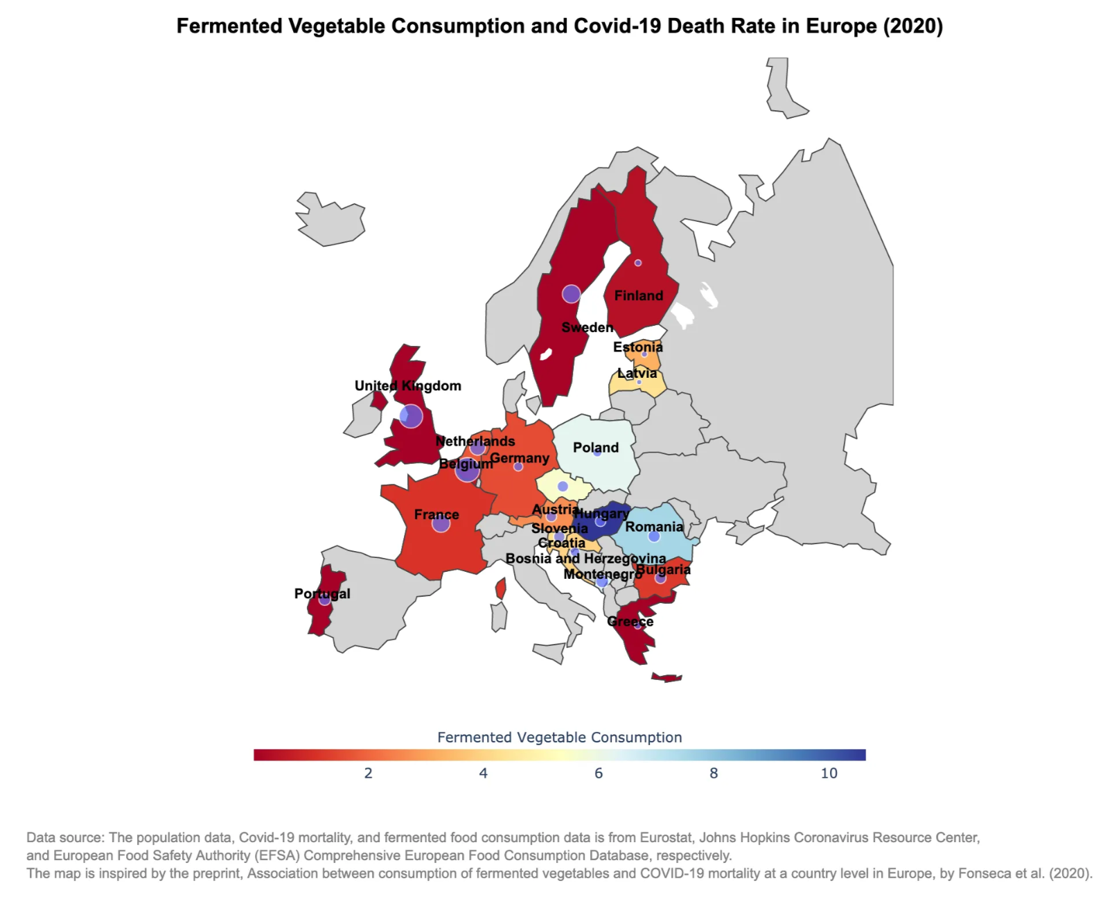
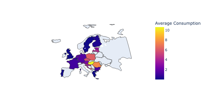
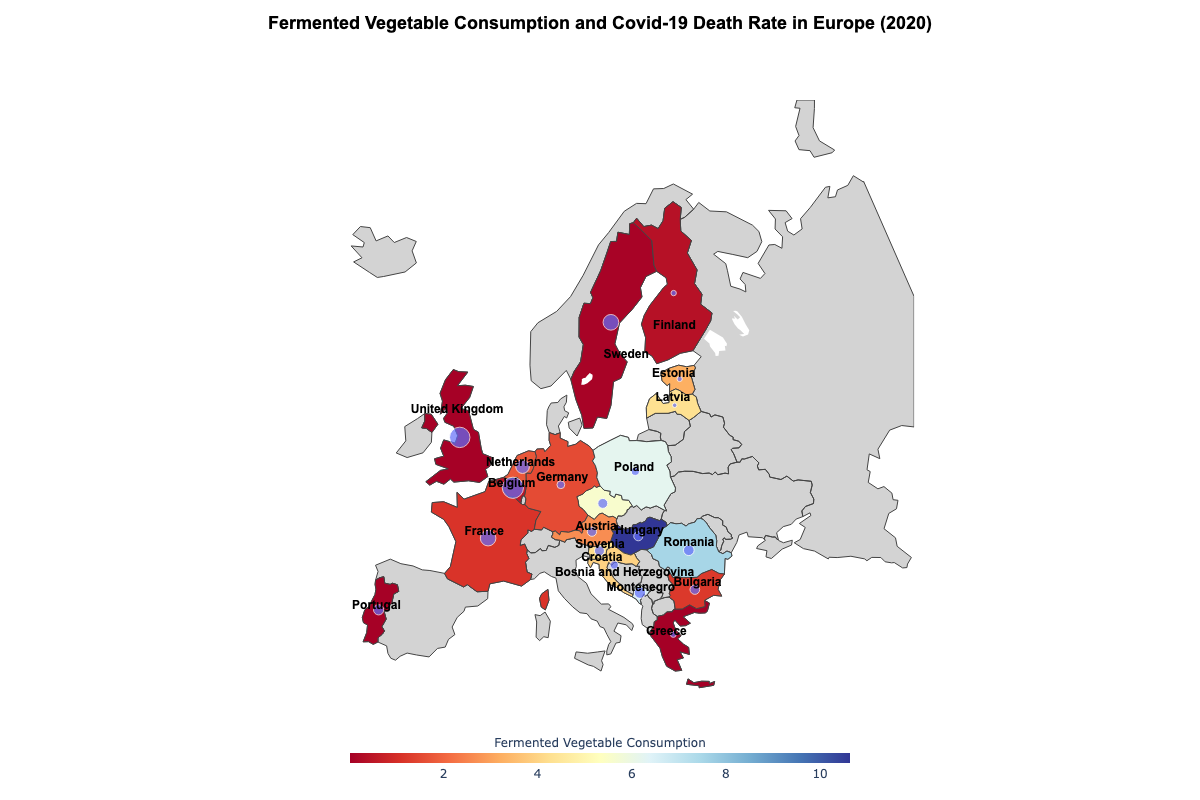
Choropleth Map – Background Color by Average Fermented Vegetables Consumption
This map shows average fermented vegetable consumption by country, shaded by intensity:
# Create a Choropleth map (for country colors) based on fermented vegetable consumption
food_map = px.choropleth(
    data_map_2020,
    locations="iso_alpha",
    color="Average Consumption",
    hover_name="Country",
    scope="europe",
    projection="natural earth",
    color_continuous_scale='Plasma'
)
🖼️ ⬇️ Example Output
Bubble Overlay – COVID-19 mortality rates
We then add circle markers to indicate COVID-19 mortality rates per country. Bigger bubbles = more intake.
import plotly.graph_objects as go

bubble_map = px.scatter_geo(data_map_2020,
                            locations="iso_alpha",
                            hover_name="Country",
                            size="Death Rate",
                            scope="europe",
                            projection="natural earth",
                            opacity=0.7, # Set opacity level for better visibility
                            size_max=15,
                            color_continuous_scale=px.colors.sequential.Plasma)
🖼️ ⬇️ Example Output:

Combine Both Layers
# Combine both layers
fig = go.Figure(data=food_map.data + bubble_map.data)
Why These Steps Matter
This combination allows us to visualize two variables on the same map:
- Red shading = how much fermented food people eat
- Bubble size = how bad COVID-19 outcomes were
It opens up exploratory insights like:
“Do countries with more fermented vegetable consumption have lower COVID-19 death rates?”
This dual-layer approach makes it intuitive to compare variables geographically.
Fine-Tuning the Map for Clarity & Style
Once we’ve layered the choropleth and bubbles, we fine-tune the map to make it easier to understand and more visually polished.
Here are some key adjustments made in the notebook:
# Improve layout
fig.update_geos(
    scope="europe", # Only show European countries
    showcoastlines=False,
    showland=True,
    landcolor="lightgray",
    projection_scale=1.5)

fig.update_layout(
    coloraxis_colorbar_title="Fermented Vegetable Consumption",
    coloraxis_colorscale="RdYlBu" , # Change color scale
    width=1200,
    height=800,
    coloraxis_colorbar=dict(
        orientation="h",  # Set colorbar horizontal
        title="Fermented Vegetable Consumption",
        title_side="top",
        title_font_size=12,
        thickness=10,  # Adjust colorbar width
        len=0.5,  # Adjust colorbar height (relative size)
        x=0.25,  # Move colorbar horizontally
        y=0.95,  # Move colorbar vertically
    )
)

fig.update_layout(
    title=dict(
        text="Fermented Vegetable Consumption and COVID-19 Death Rate in Europe (2020)",
        x=0.5,  # Center the title
        y=0.98,  # Position it above the colorbar
        xanchor="center",  # Ensure proper centering
        yanchor="top",  # Anchor at the top
        font=dict(
            size=18,  # Increase font size for better readability
            family="Arial, sans-serif",  # Use a professional font
            color="black",  # Set color (adjust if needed)
            weight="bold"  # Bolden the title (alternative: use "<b>Title</b>" in text)
        )
    )
)

fig.update_layout(
    coloraxis_colorbar=dict(
        orientation="h",  # Horizontal colorbar
        x=0.5, y=-0.15,  # Move below the map
        len=0.5, thickness=10
    )
)
These tweaks:
- Geographic layout
- Colorbar customization
- Title configuration
- Additional colorbar adjustment
Annotate country names to the map
To make the map more professional-looking and easier to interpret, we apply layout settings:
import pandas as pd

# Create the DataFrame
country_data = pd.DataFrame({
    "Country": ["Austria", "Belgium", "Bulgaria", "Bosnia and Herzegovina", "Germany", "Estonia", "Finland", "France", "United Kingdom", "Greece", "Croatia", "Hungary", "Latvia", "Montenegro", "Netherlands", "Poland", "Portugal", "Romania", "Slovenia", "Sweden"],
    "ISO3": ["AUT", "BEL", "BGR", "BIH", "DEU", "EST", "FIN", "FRA", "GBR", "GRC", "HRV", "HUN", "LVA", "MNE", "NLD", "POL", "PRT", "ROU", "SVN", "SWE"],
    "Lat": [47.5162, 50.5039, 42.7339, 43.9159, 51.1657, 58.5953, 61.9241, 46.6034, 55.3781, 39.0742, 45.1, 47.1625, 56.8796, 42.7087, 52.1326, 51.9194, 39.3999, 45.9432, 46.1512, 60.1282],
    "Lon": [14.5501, 4.4699, 25.4858, 17.6791, 10.4515, 25.0136, 25.7482, 1.8883, -3.4360, 21.8243, 15.2, 19.5033, 24.6032, 19.3744, 5.2913, 19.1451, -8.2245, 24.9668, 14.9955, 18.6435]
})

import plotly.graph_objects as go

# Create the country label layer (scattergeo)
country_labels = go.Scattergeo(
    locationmode="ISO-3",
    lon=country_data["Lon"],
    lat=country_data["Lat"],
    text=country_data["Country"],  # Display country names
    mode="text",  # Only text (no markers)
    textfont=dict(size=12, color="black", family="Arial", weight="bold"),  # Adjust font
    textposition="top center",
    showlegend=False
)

# Add to your existing Plotly figure
fig.add_trace(country_labels)
Explore the full interactive version on GitHub.
Exporting the Map
Want to save your plot as an image or HTML? Use:
pio.write_image(fig, 'fermented_vegetable_consumption_COVID_death_rate_europe_2020.png', format='png', width=1200, height=800, scale=2)                  # Save as PNG

pio.write_html(fig, file='index.html', auto_open=True)       # Save as interactive webpage
This step is great for sharing visuals in presentations or embedding interactive plots on your own blog or website.
Together, these finishing touches elevate your map from “functional” to “insightful and polished.” They also make the visualization more friendly to readers who are new to data exploration or unfamiliar with the dataset.
What Does the Map Tell Us?
As we zoom into this interactive map, a few patterns emerge:
- Countries like Hungary and Romania — with relatively high intake of fermented vegetables — show noticeably lower COVID-19 mortality in this 2020 dataset.
- On the other hand, countries with lower fermented food consumption, such as the UK or Belgium, show higher death rates.
- While this map doesn’t prove causality, it does support the hypothesis from [the original study] that dietary habits might influence immune resilience — a fascinating intersection of public health and nutrition.
Of course, many other factors (like healthcare infrastructure or testing policies) may also be at play. But that’s the beauty of this kind of map — it opens up questions and encourages deeper exploration.