Visualizing Microbiome Taxonomy with Metacoder in R: A Step-by-Step Guide
Introduction
In microbiome research, stacked bar charts are a go-to method for showing the abundance of different taxa. But there’s a catch — they don’t really show the hierarchical relationships within the taxonomy data.
That’s where the metacoder R package comes in. Published in PLoS ONE in 2017 and available on CRAN, metacoder makes it easier to explore and visualize taxonomy in a way that reflects its natural hierarchy, while also mapping data across different taxonomic levels.
In this post, I’ll show you how to turn your own data into clean, publication-ready plots using metacoder. The package includes helpful tutorials, but they don’t always cover every scenario — like the one I’ll walk you through here.
I’ll also share tips and lessons learned from my experience as an intermediate R user and microbiome researcher, so you can save time and avoid common pitfalls.
Example
For this example, I used a dataset curated from the review by Dr. Micheal Gaenzle on key microbiomes in food fermentation. The input data includes the full taxonomy lineages for more than 30 genera commonly involved in food fermentation.
One particularly interesting table in the review maps these 30+ bacterial genera to 115 types of fermented foods from around the world. That inspired me to create a family-focused heat tree to visualize the biodiversity of bacteria involved in fermentation.
Gathering detailed metadata for a perfectly accurate tree takes time, so for now, I worked with aggregated data — specifically, the proportion of fermented food types linked to each genus. While metacoder can integrate numeric data into heat trees, I found that it generated a misleading legend in this case. To keep the visualization clear, I’ve chosen not to display numeric values on the plot. Instead, I’ll describe the distribution of key bacterial families in the text alongside the visualization.
The example input data can be download here.
With that context set, let’s walk through the steps to prepare the data and generate the heat tree in R, so you can try it with your own dataset.
Programmatic workflow
The overall workflow for this example is straightforward and involves three main steps:
- Read the taxonomy input data
- Parse the data into a taxmap object that is compatible with metacoder
- Generate and customize the heat tree visualization
In the next sections, I’ll walk through each step, showing the code and explaining how you can adapt it to your own dataset.
Implementation in R
1. Load and inspect your taxonomy data
# Load required library
library(metacoder)
library(ggplot2)

# Read in the taxonomy input file
tax_abund <- read.csv("tax_abund_data.csv")
> head(tax_abund)
  Species_label Fermented.foods1 normalized_prop        Kingdom         Phylum
1         spp_1               16       0.1391304 Pseudomonadati Pseudomonadota
2        spp_10              101       0.8782609      Bacillati      Bacillota
3        spp_11              101       0.8782609      Bacillati      Bacillota
4        spp_12              101       0.8782609      Bacillati      Bacillota
5        spp_13              101       0.8782609      Bacillati      Bacillota
6        spp_14              101       0.8782609      Bacillati      Bacillota
                Class           Order           Family                   Genus
1 Alphaproteobacteria Acetobacterales Acetobacteraceae             Acetobacter
2             Bacilli Lactobacillales Lactobacillaceae    Companilactobacillus
3             Bacilli Lactobacillales Lactobacillaceae Schleiferilactobacillus
4             Bacilli Lactobacillales Lactobacillaceae       Ligilactobacillus
5             Bacilli Lactobacillales Lactobacillaceae     Lactiplantibacillus
6             Bacilli Lactobacillales Lactobacillaceae      Loigolactobacillus
  Species
1      NA
2      NA
3      NA
4      NA
5      NA
6      NA
This file contains the full taxonomy lineages for approximately 30 genera mentioned in Dr. Gaenzle’s review.
- Rows: Each row represents one genus.
- Columns: Include the full taxonomy path (Kingdom → Phylum → Class → Order → Family → Genus), along with aggregated counts and proportions of food types containing that genus.
- Species column: Values are set to NA where species-level data is not available.
2. Parse the data into a taxmap object
obj <- parse_tax_data(tax_abund, class_cols = 4:9, named_by_rank = TRUE)
> print(obj)
<Taxmap>
  66 taxa: ab. Pseudomonadati, ac. Bacillati ... co. Lactobacillus
  66 edges: NA->ab, NA->ac, ab->ad ... bd->cm, be->cn, at->co
  2 data sets:
    tax_data:
      # A tibble: 36 × 11
        taxon_id Species_label Fermented.foods1 normalized_prop
        <chr>    <chr>                    <int>           <dbl>
      1 bf       spp_1                       16           0.139
      2 bg       spp_10                     101           0.878
      3 bh       spp_11                     101           0.878
      # ℹ 33 more rows
      # ℹ 7 more variables: Kingdom <chr>, Phylum <chr>, Class <chr>,
      #   Order <chr>, Family <chr>, Genus <chr>, Species <lgl>
      # ℹ Use `print(n = ...)` to see more rows
    tax_abund:
      # A tibble: 66 × 2
        taxon_id normalized_prop
        <chr>              <dbl>
      1 ab                 0.835
      2 ac                20.7
      3 ad                 0.835
      # ℹ 63 more rows
      # ℹ Use `print(n = ...)` to see more rows
  0 functions:
parse_tax_data() transforms your table into a taxmap object that powers the heat tree visualization.
- The
class_colsargument points to the column that contains the taxonomy path. - Setting
named_by_rank= TRUE ensures the function recognizes each taxonomic rank correctly.
3. Generate the heat tree
set.seed(123)

ht_plot_abund <- heat_tree(obj,
    node_label = obj$taxon_names(),
    node_color = obj$n_obs(),
    node_color_range = c("purple", "yellow", "red"),
    initial_layout = "reingold-tilford",
    layout = "davidson-harel",
    node_color_axis_label = "Number of genera \nwithin the taxa"
)

ht_plot_abund
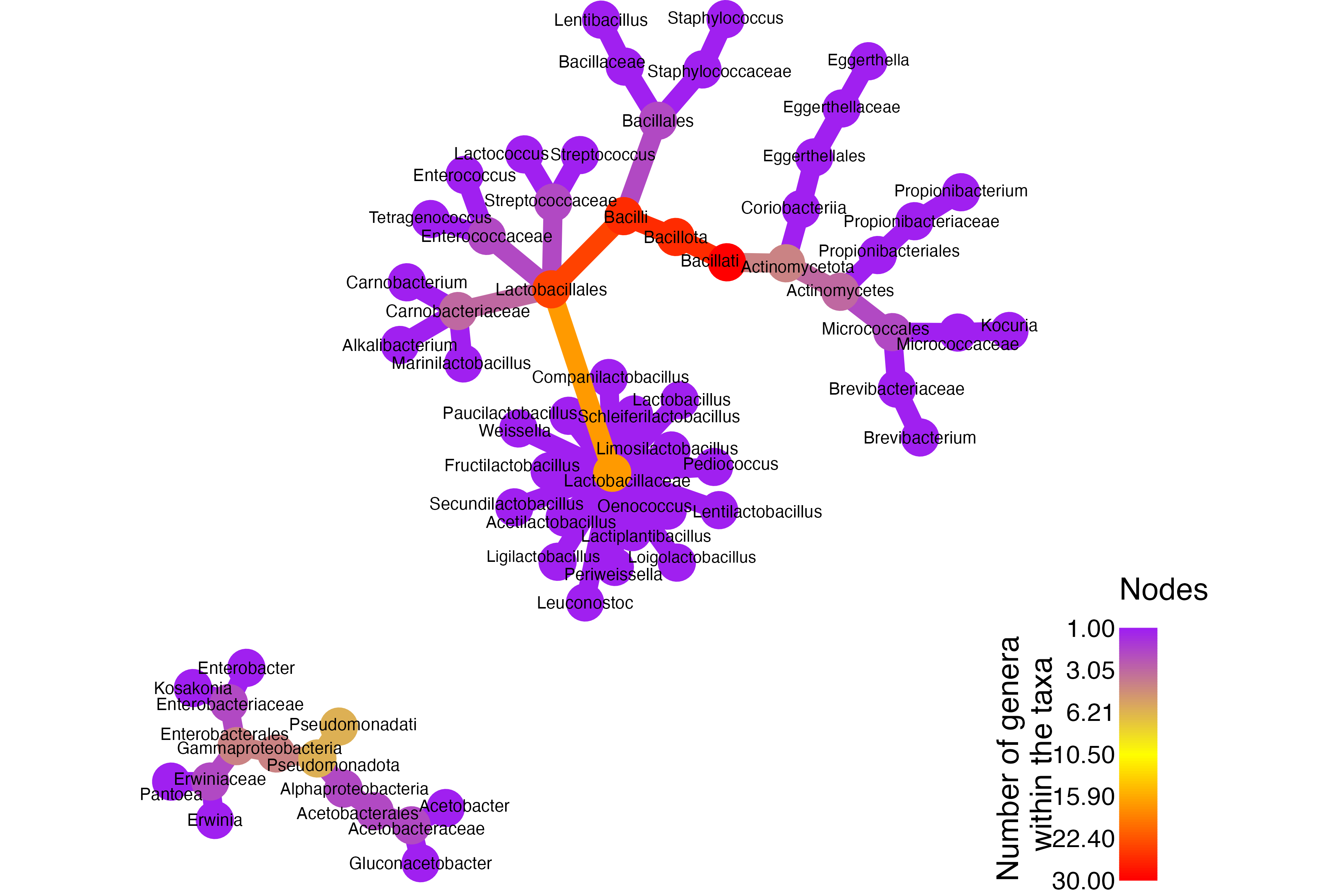
This initial plot focuses on showing the hierarchical relationships.
- Because the numeric proportions generated a misleading legend, no quantitative data are mapped here.
- This keeps the visualization clean while still clearly showing the relationships between families and genera involved in fermentation.
Bonus
Optional: Add quantitative data (with caution)
After you’ve parsed your taxonomy into a taxmap object, you can compute per-taxon values (e.g., the proportion of fermented food types per genus) and attach them to the object for plotting.
# Calculate per-taxon abundance (here using a column called "normalized_prop")
# This creates obj$data$tax_abund with one value per taxon
obj$data$tax_abund <- calc_taxon_abund(
	obj,
	"tax_data",
	cols = "normalized_prop")

# Draw a heat tree using the computed values
set.seed(123)

ht_plot_abund2 <- heat_tree(obj,
    node_label = obj$taxon_names(), # Show taxon names
    node_size = obj$data$tax_abund$normalized_prop, # Size by proportions
    node_color = obj$data$tax_abund$normalized_prop, # Color by proportions
    node_color_range = c("purple", "yellow", "red"), # Color palette
    initial_layout = "reingold-tilford",
    layout = "davidson-harel",
    node_color_axis_label = "Prop in Fermented Foods"
)

ht_plot_abund2
Why the caution?
Mapping numbers to node color/size can be powerful, but the legend and scaling can be misleading if your values are tightly clustered, all zeros, or contain many missing values. In my case, the legend confused readers, so I left numeric mappings out of the final figure and explained key patterns in the text instead.
Optional: Focus at the family level
You can subset the taxonomy to simplify the figure or highlight a specific level (e.g., family) and then plot. This often reveals clearer biological patterns.
# Keep families (and their super/subtaxa as you prefer) and color by count of child taxa
# The example below hides genus nodes to emphasize family-level structure.

ht_plot_abund3 <- obj %>%
    filter_taxa(taxon_ranks != "Genus") %>% # Drop genus nodes for a cleaner family-level view
    heat_tree(node_label = taxon_names,
    node_color = n_obs,
    node_color_range = c("purple", "yellow", "red"),
    initial_layout = "reingold-tilford",
    layout = "davidson-harel",
    node_color_axis_label = "Number of \ngenera within")

ht_plot_abund3
Data Interpretation
The heat tree highlights several key insights about the diversity of bacteria involved in food fermentation:
- Core Fermenters – Families like Lactobacillaceae, Leuconostocaceae, Streptococcaceae, Enterococcaceae, and Carnobacteriaceae form the backbone of dairy, cereal, and vegetable fermentations.
- Initiators – Enterobacteriaceae and Erwiniaceae often kick-start spontaneous fermentations in vegetables, cereals, tubers, coffee, and cocoa.
- Niche Specialists – Acetobacteraceae, Bacillaceae, and Propionibacteriaceae are critical in vinegar, natto, soy/ fish sauces, and Swiss cheese fermentations.
- Surface & Meat Fermenters – Families like Staphylococcaceae, Micrococcaceae, and Brevibacteriaceae play key roles in ripening, aroma development, and safety in meat and cheese fermentations.
- Minor but Emerging Players – Eggerthellaceae show a secondary but notable presence in vegetable fermentations such as sauerkraut and kimchi.
These insights not only showcase the rich biodiversity of fermenting microbes but also highlight their specialized roles in shaping flavors, textures, and safety across different foods. For researchers, educators, or fermentation enthusiasts, such visualizations can guide strain selection, recipe development, and deeper exploration into the microbial ecosystems that make our favorite fermented products possible.
Personal tips
Here are a few tips from my experience working with metacoder.
Start with the examples: The package tutorials and help docs include plenty of sample datasets. Taking time to explore these will make it much easier to prepare your own input data correctly.
Legend adjustments are limited: While metacoder offers a lot of flexibility in customizing your plots, the position of the legend doesn’t seem to be adjustable. Plan your layout with that limitation in mind.
Interpret node sizes and colors carefully: These elements are proportional to your quantitative data, such as OTU counts or other biological variables. Always double-check your legend to avoid over- or under-interpreting the results.