When Excel Maps Fall Short: A Pragmatic Labeling Solution for HEOR Analysts
Problem
Excel is one of the most widely used data tools among HEOR analysts. Its built-in map chart functionality offers a quick and intuitive way to transform complex numerical outputs into visually engaging and interpretable graphics.
In my own work, I frequently rely on Excel map charts for client-facing slide decks. Compared with Python or R, Excel allows for rapid iteration without requiring additional programming, which is especially valuable under tight timelines.
However, a recurring limitation arises when using Excel for epidemiological mapping: country or region names cannot always be fully displayed on the map. This results in unlabeled areas, reduced clarity, and potential misinterpretation, particularly when presenting to non-technical stakeholders.
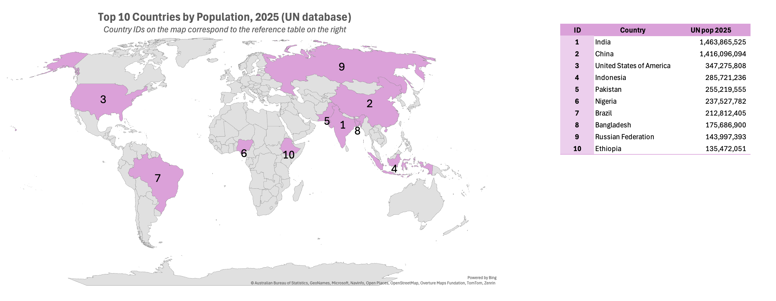
I initially tried to address this by manually labeling individual countries, but this approach quickly became tedious and impractical, especially for global or multi-region analyses. This led me to ask a simple question: Is there a smarter way to improve labeling in Excel map charts?
The answer, fortunately, is yes.
This blog post shares a simple yet effective workaround that improves the interpretability of Excel map charts while preserving their ease of use. The approach complements Excel’s limitations rather than fighting against them.
Solution
The workaround is based on three key steps:
- Map country identifiers (IDs) to the Excel map chart instead of the epidemiological variable itself (e.g., population size or prevalence).
- Adjust the default color gradient to a single, uniform color, since the mapped values (country IDs) are not intended to convey magnitude.
- Attach a companion table that links each country ID to the country name and the epidemiological variable of interest (e.g., population size or disease prevalence).
Together, these steps allow Excel map charts to remain visually clean while restoring interpretability through a structured, readable reference, making them suitable for both analytical review and client-facing communication.
Why This Works
This approach works by separating visual structure from data interpretation.
Excel map charts are well suited for showing geographic coverage but are limited in labeling and dense annotation. Mapping country IDs, rather than epidemiological values, uses the map purely as a spatial scaffold, avoiding misleading color gradients and false signals of magnitude. Applying a single, neutral color reinforces that the map shows where, not how much.
Interpretation is handled through a companion table, which provides precise country names and epidemiological metrics without spatial constraints. Together, the map and table deliver clarity without clutter.
In short, this workaround leverages Excel’s strengths while bypassing its labeling limitations, resulting in a practical, interpretable visualization for HEOR and epidemiological communication.
HEOR Takeaway
This figure exemplifies a pragmatic HEOR principle: Use the visualization to answer one clear question, and move everything else out of the chart.
The map answers “Which countries are included?”
The table answers “What are the values?”
That clarity is exactly what makes this solution defensible, scalable, and client-safe.