How to Draw Publication-Ready Heatmap with Dendrograms in Minutes Using Excel
Introduction
Heatmaps are one of the most effective visualization tools for revealing patterns in multivariate data. They are widely used in biomedical and epidemiological research because they allow readers to quickly identify relationships across many variables simultaneously.
However, for Excel users with limited coding experience, creating a publication-ready heatmap, especially one combined with a dendrogram for clustering, is usually difficult. Excel’s built-in chart tools do not support hierarchical clustering visualizations, and replicating such figures manually is impractical.
Fortunately, this limitation has recently changed.
With the introduction of Python in Excel, users can access powerful visualization libraries such as matplotlib and seaborn directly within Excel. This means that advanced visualizations traditionally created in Python or R can now be generated inside an Excel workbook.
In this article, I demonstrate a simple and reusable workflow for creating a heatmap with hierarchical clustering using Excel and Python.
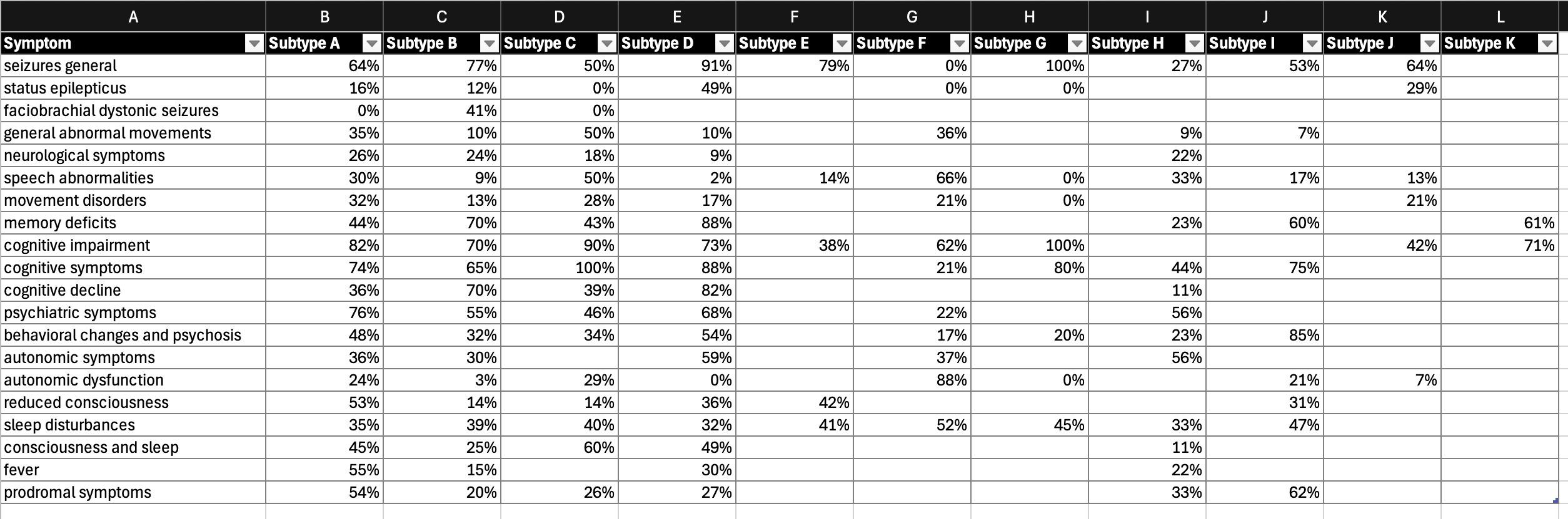
The example use case is based on symptom frequency across subtypes of an autoimmune disorder. The goal is to transform a complex data matrix (20 symptoms × 11 disease subtypes) into a visual representation that reveals patterns in clinical manifestations and potential similarities between subtypes.
Once the workflow is set up, generating the heatmap requires only a few seconds and minimal coding. The re-usable Excel template provided with this guide includes an example dataset and ready-to-run Python scripts, allowing users to create publication-ready heatmaps with ease.
Why Heatmaps Matter in Biomedical Data
Biomedical datasets often contain many variables measured across multiple groups. In the example used here, each cell represents the frequency of a symptom within patients of a specific disease subtype.
Looking at such data in a raw table makes it difficult to detect patterns.
Heatmaps solve this problem by:
- mapping values to color gradients
- clustering similar rows and columns
- revealing hidden structure in complex datasets
When combined with hierarchical clustering (dendrograms), heatmaps can also help identify groups of variables or disease subtypes with similar characteristics.
Step-by-Step Guide
This mini guide demonstrates how to create a heatmap with a dendrogram in Excel using a use case of symptom frequency in an autoimmune disorder. The goal is to translate a complex data matrix (20 symptoms × 11 subtypes) into clear visual patterns and identify potential similarities among subtypes based on clinical manifestations.
The workflow can be implemented entirely in Excel with basic Python skills. Users who wish to reproduce this visualization can follow the five steps below.
Step 1: Prepare the data matrix in Excel
Copy the data matrix into a new worksheet and define it as a named range.
- Rows: symptom names
- Columns: subtype names
- Values: frequency of each symptom within patients of a given subtype
These headers can be replaced with any variables relevant to your analysis.
Step 2: Convert the Excel table to a Python DataFrame
In an empty cell, select Formula → Insert Python and enter:
df = xl("SymptomTable[#All]", headers=True)
This converts the Excel table into a Python DataFrame (df), the standard data structure used by the pandas ecosystem.
Tip: Use arrayPreview to quickly verify that the data has been imported correctly.
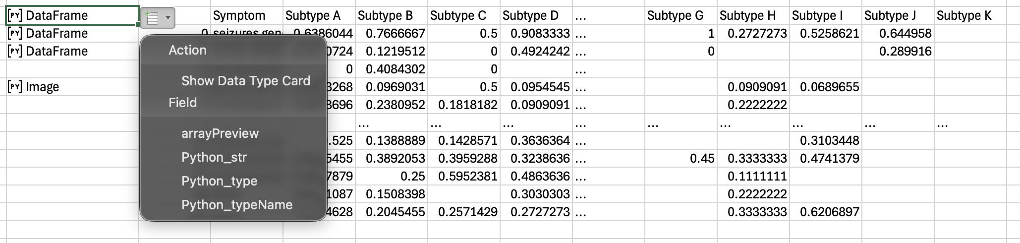
Step 3: Set the first column as the index
Set the first column (e.g., symptom names) as the DataFrame index:
df = df.set_index("Symptom")
Use the column name, not the column number, when referencing columns.
Step 4: Replace missing values
The clustermap() function cannot process missing values. Replace empty cells and NA values with zero:
df = df.replace("", 0).fillna(0)
You can again use arrayPreview to confirm the cleaned dataset.
Step 5: Create the heatmap with dendrograms
This step requires only two lines of code:
import seaborn as sns
sns.clustermap(df, cmap='RdYlGn_r', vmin=0, vmax=1, col_cluster=True, row_cluster=True)
The clustermap() function generates both the heatmap and hierarchical clustering dendrograms. Additional customization options (e.g., color maps and clustering methods) are available in the official documentation:
https://seaborn.pydata.org/generated/seaborn.clustermap.html
Fine-tuning visualization
You can further adjust elements such as color themes and clustering methods.
In this example, a gradient color was used to represent high to low symptom frequency, providing an intuitive interpretation for most readers.
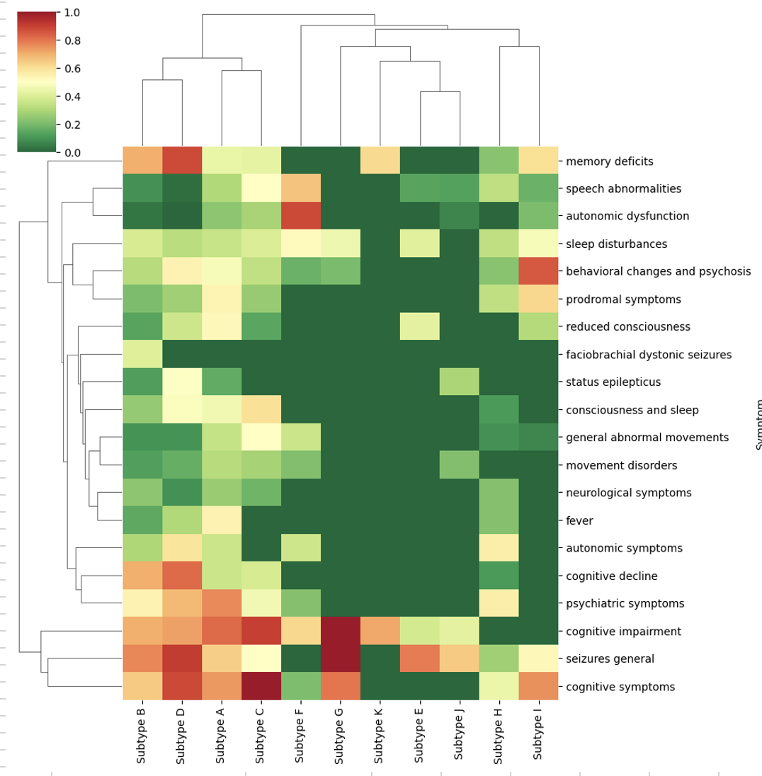
Interpretation of the heatmap
The heatmap reveals meaningful patterns in the dataset.
Some clusters are dominated by cognitive and seizure symptoms, while others show stronger psychiatric or neurological features, revealing potential similarities among subtypes.
Such visualizations help researchers quickly detect patterns that would otherwise be difficult to identify from raw tables.
Availability of Python in Excel
Python in Excel is currently available in Microsoft Excel for Microsoft 365 with recent updates.
It allows users to run Python code directly inside Excel cells for advanced data analysis and visualization.
Most Microsoft 365 subscribers can access this feature, although some advanced capabilities may require additional licensing.
Takeaway
Python-powered visualization tools complement Excel, one of the most widely used platforms in the HEOR and health analytics community, by enabling advanced charts that go beyond Excel’s built-in capabilities.
The reusable Excel template provided with this guide includes an example dataset and ready-to-run Python scripts, allowing users to generate publication-ready heatmaps with minimal setup.